
SelfCheck
SelfCheck is a healthcare brand identity. Techformia designed a logo that pairs the "self" wordmark with a check mark, then built a color palette, typography and a set of applications across signage, posters, print and mobile content.

Project Overview
We developed a calm, trustworthy identity for a health brand centered on checking in with yourself. The identity needed to feel human and approachable while remaining clear on public signage, printed material and a phone screen.
- Logo combining the "self" wordmark with a check mark
- Color palette and typography
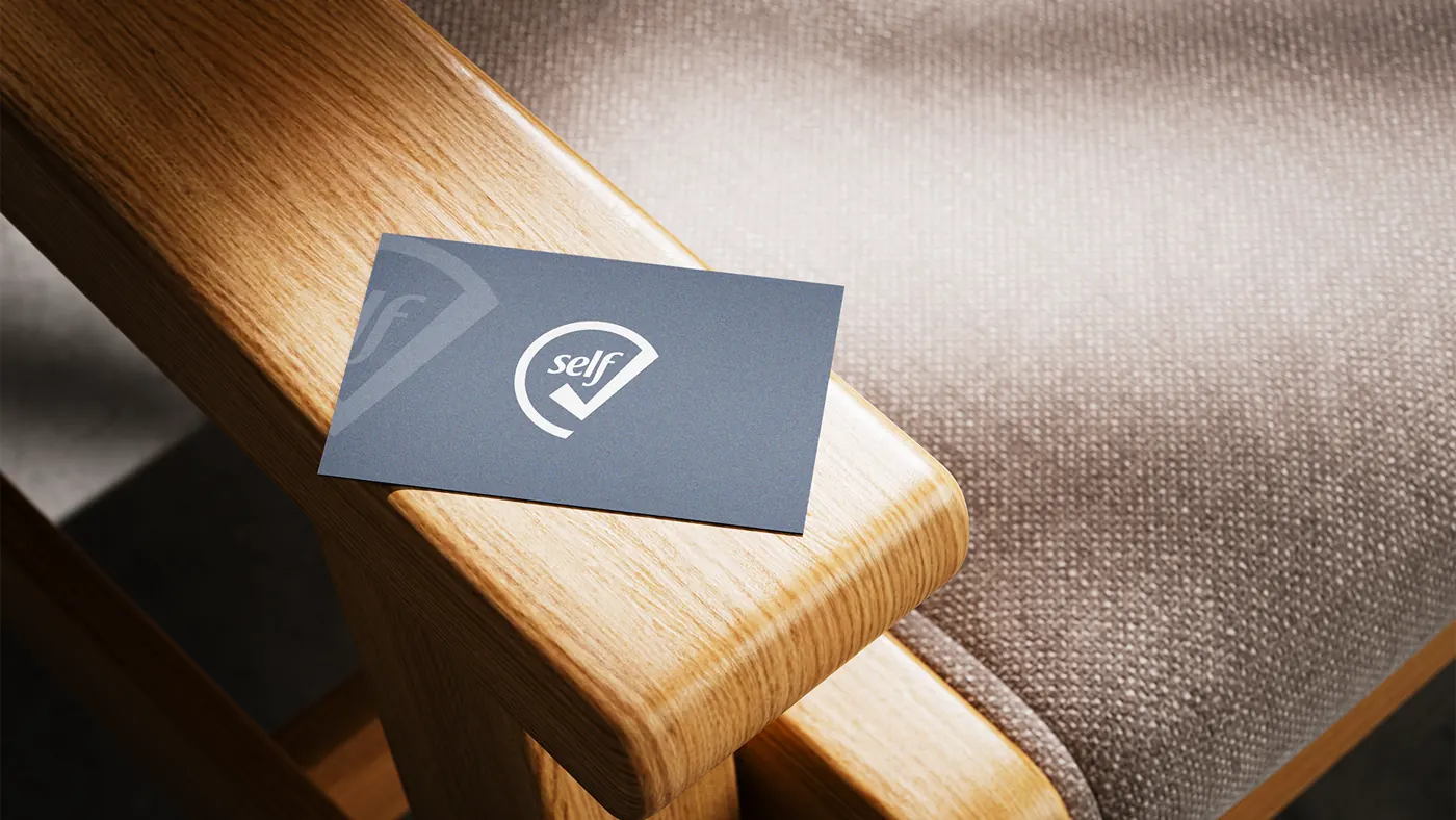
- Business card
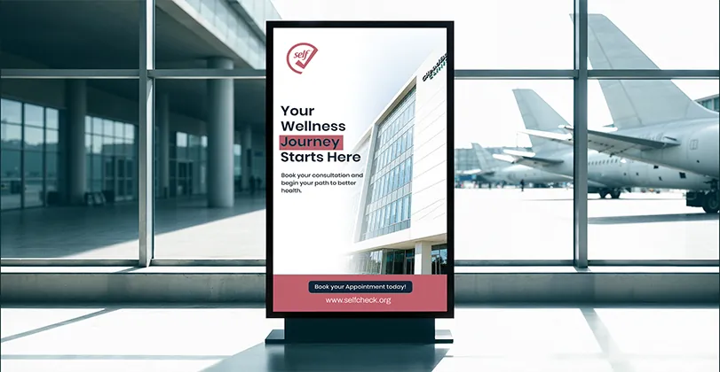
- Billboard, bus-shelter and poster designs
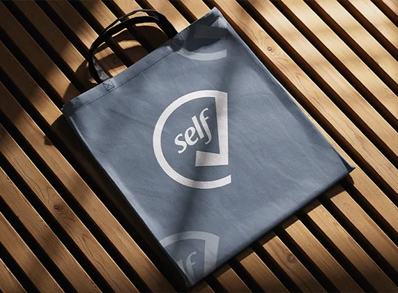
- Tote bag and mobile content mockups


Brand Identity
The logo wraps the "self" wordmark in an open circle that resolves into a check mark, communicating self-assessment and reassurance in one simple symbol.
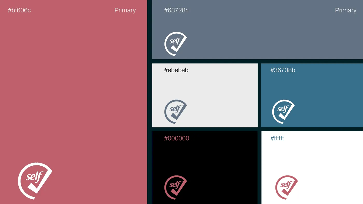
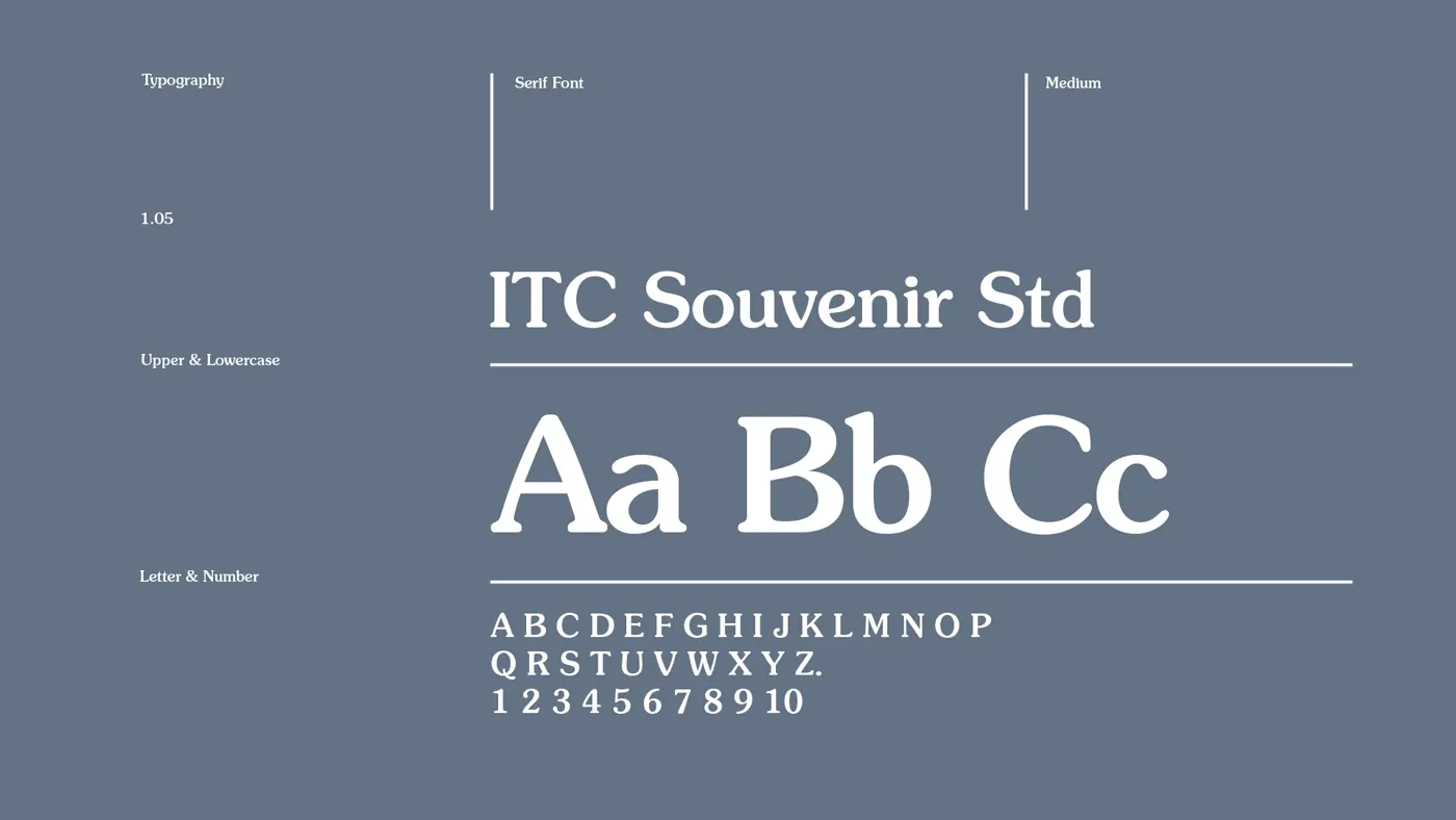
The primary colors are a muted rose (#bf606c) and a slate blue-gray (#637284), supported by a deeper teal (#36708b), light gray (#ebebeb), black and white. Typography is set in ITC Souvenir Std, a warm serif that keeps the health content approachable and easy to read.
Brand in Use
A selection of applications that show the identity across print, public signage and digital.




Color and Typography
The color palette and the ITC Souvenir Std type specimen, shown in full.

Work With Us
SelfCheck shows how one simple symbol and a restrained palette can carry a health brand from a business card to a billboard. To start a project of your own, contact us at info@techformia.com.
 Let's talk about your project!