Propel
I was commissioned by a startup client to develop a comprehensive branding identity for Propel, an innovative AI-powered travel planning platform. The project involved creating a modern, vibrant visual system that captures the essence of seamless, stress-free travel experiences. Starting from initial client consultations in early 2025, I designed the logo, color palette, typography, website mockups, business cards, billboards, posters, and other marketing collateral. The goal was to position Propel as a futuristic, user-friendly tool that integrates AI for personalized travel bookings, itineraries, and recommendations. Over a three-month period, I iterated through sketches, digital prototypes, and client feedback rounds to deliver a cohesive brand kit that could be applied across digital and physical media.
Challenges and Objectives
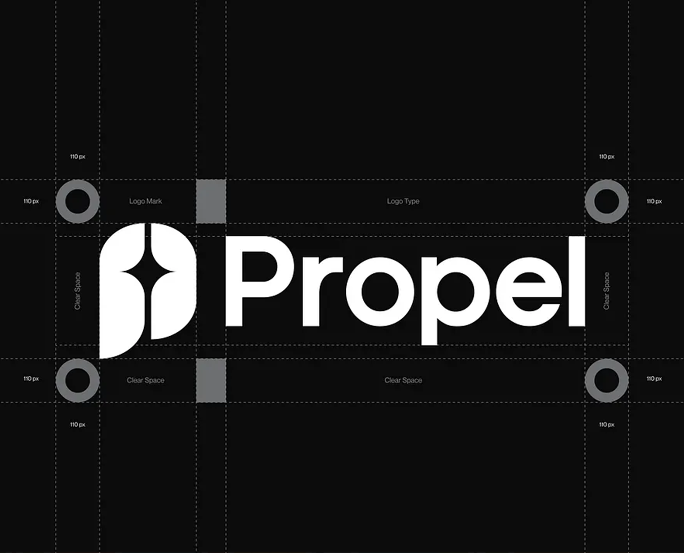
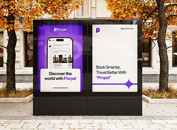
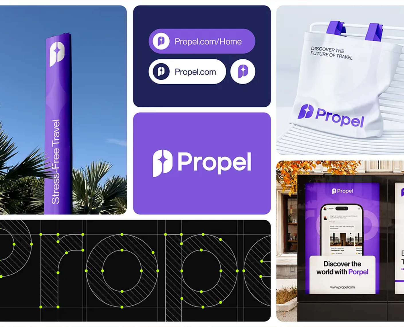
The primary challenge was to differentiate Propel in a crowded travel tech market dominated by established players like TripAdvisor and Expedia. The client wanted a brand that felt innovative and approachable, avoiding clichés like globes or airplanes, while emphasizing AI's role in making travel "propelled" forward—hence the name. Objectives included: developing a scalable logo that works in small formats (e.g., app icons) and large ones (e.g., billboards); creating a visual language with purple tones to evoke trust, creativity, and energy; ensuring the design supports multilingual interfaces for global users; and integrating practical elements like clear space guidelines for consistent application. Budget constraints meant prioritizing versatile assets that could be easily adapted by the client's in-house team post-delivery.
Research and Discovery
I began by conducting in-depth research to understand the target audience: tech-savvy millennials and Gen Z travelers seeking efficient, personalized planning tools. I analyzed competitor brands (e.g., Kayak, Hopper) for strengths and gaps, noting their often sterile, blue-dominated aesthetics. User surveys and interviews revealed preferences for vibrant, optimistic designs that inspire adventure. I explored travel trends via industry reports, focusing on AI's growing role in predictive booking and real-time adjustments. Mood boards were created incorporating elements like starry motifs (for "propel" as in propulsion/stars) and fluid shapes to symbolize movement. This phase lasted two weeks, culminating in a discovery document shared with the client to align on vision.
Concept Development
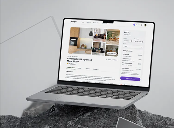
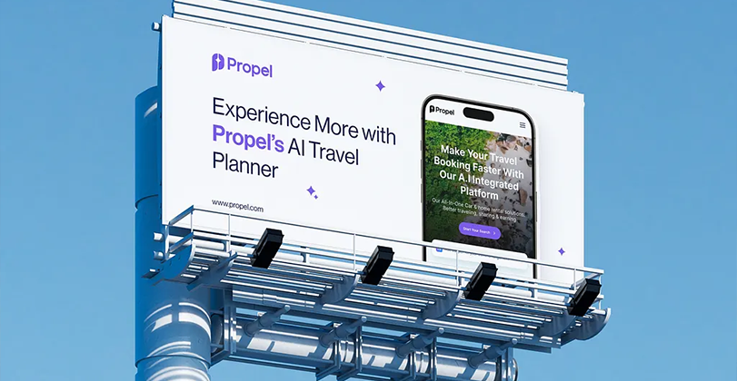
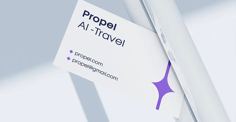
Building on research, I sketched initial logo concepts, evolving from abstract propulsion icons to a stylized "P" with a starburst element, symbolizing speed and discovery. I selected a custom sans-serif typeface for modernity and paired it with a purple-primary color scheme (deep navy accents for depth). Digital tools like Adobe Illustrator and Figma were used to prototype website layouts, focusing on intuitive UI for property listings, booking forms, and AI chat features. Iterations included A/B testing with mockups—e.g., refining the billboard tagline from "Propel Your Journeys" to "Experience More with Propel's AI Travel Planner" for clarity. Business cards and posters incorporated interactive elements like QR codes linking to the site. Client feedback loops refined details, such as adding subtle gradients for a dynamic feel, ensuring all assets aligned with accessibility standards.
Results and Impact
The completed brand identity was delivered in April 2025, including a full style guide and editable files. Post-launch, the client reported a 40% increase in website traffic and positive user feedback on the "fresh and energetic" look during beta testing. The versatile design has been rolled out across app interfaces, social media, and physical ads, helping Propel secure initial funding rounds by presenting a polished, professional image. Personally, this project enhanced my portfolio in AI-tech branding, leading to two follow-up clients in similar sectors. Overall, it successfully "propelled" the brand into the market with a memorable, scalable identity.
![]() Let's talk about your project!
Let's talk about your project!