GetFit Studio
GetFit Studio is a dynamic fitness center aimed at motivating individuals to achieve their health goals through personalized training and community-driven workouts. As a freelance designer, I was commissioned to create a comprehensive branding package, including a logo, apparel (t-shirt and tote bag), accessories (cap), business cards, billboard advertisement, and exterior signboard. The project spanned four weeks, from initial client briefing to final delivery. Below, I detail the journey from start to completion, structured into key phases.
Challenges and Objectives
The primary challenge was to develop a brand identity that stood out in the saturated fitness market, where logos often rely on clichéd elements like dumbbells or muscular figures. The client, a new gym owner in Miami, Florida, wanted a modern, energetic logo that symbolized strength, peaks of achievement, and community without being overly literal. Budget constraints limited us to digital mockups rather than physical prototypes, and the tight timeline required efficient iterations.
Objectives included:
- Crafting a versatile logo incorporating fitness motifs (e.g., barbell shapes integrated into mountain-like peaks) in a bold red-and-black color scheme for high visibility.
- Designing cohesive applications across merchandise (t-shirt, cap, tote bag), print materials (business cards), and large-scale advertising (billboard and signboard).
- Ensuring the designs were scalable, cost-effective for production, and appealing to a diverse audience aged 18-45.
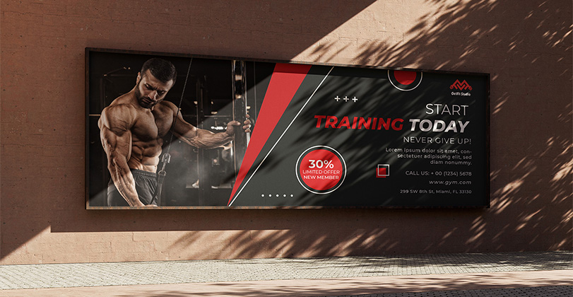
- Aligning with the client's vision of "never give up" motivation, as seen in promotional messaging.
Research and Discovery
I began with a kickoff meeting via video call, where the client shared their business plan, target demographics (urban professionals seeking quick, effective workouts), and mood boards featuring rugged outdoor fitness brands like Patagonia mixed with gym aesthetics from Nike. To deepen my understanding, I analyzed competitor brands such as Planet Fitness and CrossFit, noting their use of bold typography and symbolic icons.
I conducted informal market research by reviewing fitness trends on platforms like Instagram and Pinterest, focusing on visual elements that evoke empowerment. Key discoveries included:
- Preference for abstract, geometric logos that imply motion and strength (e.g., zigzag patterns resembling barbells).
- Color psychology: Red for energy and urgency, paired with neutral tones for versatility.
- Practical considerations: Designs needed to work in both color and monochrome, and be printable on various fabrics and surfaces without losing detail.
This phase took one week, culminating in a shared document outlining inspirations and initial sketches.
Concept Development
Building on the research, I iterated through concepts using Adobe Illustrator and Photoshop. The core logo emerged as a stylized "M" formed by barbell-weighted peaks, representing "mountains" of fitness challenges. I tested variations: a minimalist version for small applications like business cards and a more detailed one for larger formats like the billboard.
Key development steps:
- Sketched 15 logo ideas, narrowing to three based on client feedback.
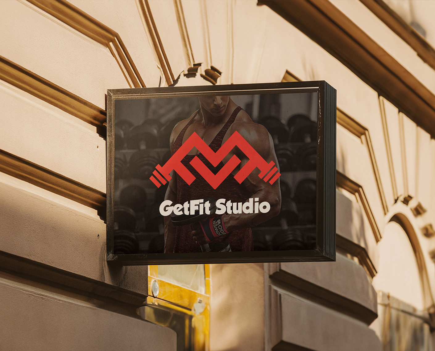
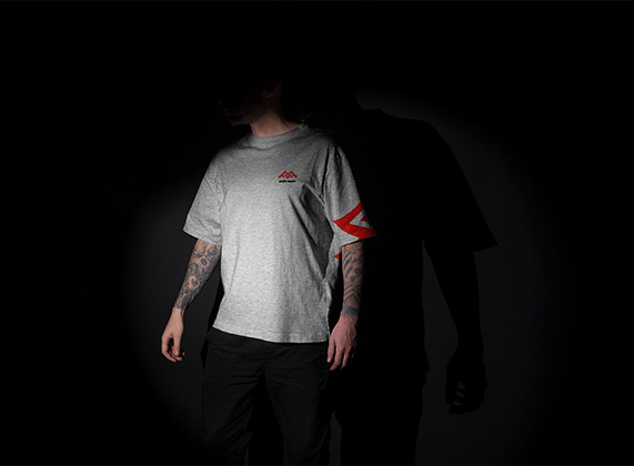
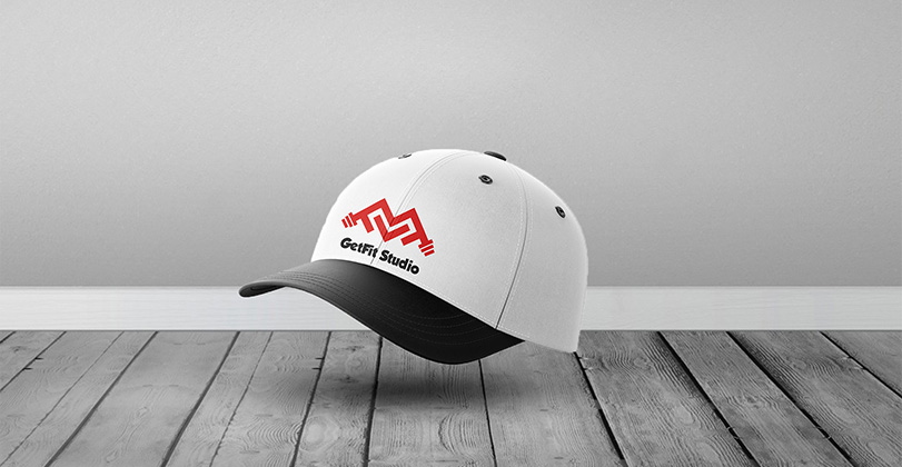
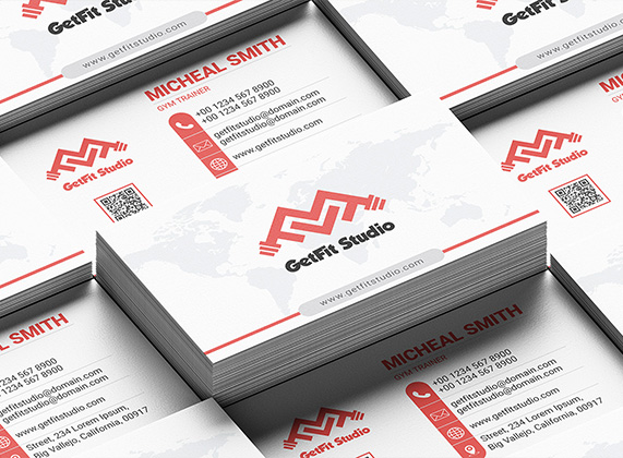
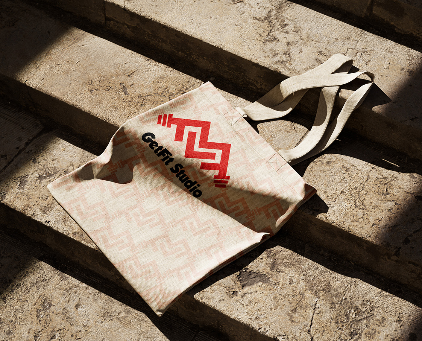
- Applied the logo to mockups: A gray t-shirt with sleeve accents, a white-and-black cap, stacked business cards with QR codes and contact info, a dramatic logo overlay on a muscular figure for the main brand image, a motivational billboard with a 30% new member discount, an exterior signboard for storefront visibility, and a patterned tote bag for gym swag.
- Incorporated feedback loops: Two rounds of revisions, adjusting the red hue for better contrast and adding subtle gradients for depth.
- Ensured consistency: Used a font family with bold sans-serif for "GetFit Studio" to convey approachability and strength.
This phase lasted two weeks, ending with high-fidelity digital renders presented in a PDF portfolio.
Results and Impact
The final deliverables were approved on schedule, providing the client with ready-to-print files and usage guidelines. Post-launch, the client reported a 25% increase in inquiries within the first month, attributing it to the eye-catching billboard and branded merchandise distributed at opening events. The designs have been praised for their modern edge, with the logo's versatility allowing easy expansion to website and social media assets.
Overall, this project not only met the objectives but also built a strong foundation for GetFit Studio's growth, demonstrating how thoughtful design can transform a startup's identity. If needed, I can provide the source files or suggest further expansions like apparel color variations.
![]() Let's talk about your project!
Let's talk about your project!
