Coastal Kitchen
As a graphic designer, I was commissioned by Coastal Kitchen, a seafood restaurant established in 1968, to create a comprehensive branding identity that captures the essence of fresh, coastal cuisine. The project involved designing a logo, stationery set, social media templates, and various signage elements. I started the project by meeting with the client to understand their vision, then progressed through research, ideation, refinement, and final delivery over a period of 8 weeks. Below, I detail the key phases of how I approached and completed this project.
Challenges and Objectives
The primary challenge was to modernize the brand while honoring its long history since 1968, without alienating its loyal customer base who associate it with traditional seafood dining. The restaurant wanted a visual identity that evokes the ocean's freshness and flavor, but it needed to stand out in a competitive market filled with generic nautical themes. Additional hurdles included ensuring versatility across print (like stationery and signage) and digital (social media) formats, while incorporating sustainable elements to reflect their eco-friendly sourcing practices.
The main objectives were:
- Develop a unique logo inspired by marine life that symbolizes freshness and coastal heritage.
- Create cohesive branding assets that enhance brand recognition and customer engagement.
- Design materials that are practical for everyday use, such as durable signage and eye-catching social posts to drive foot traffic and online interactions.
Research and Discovery
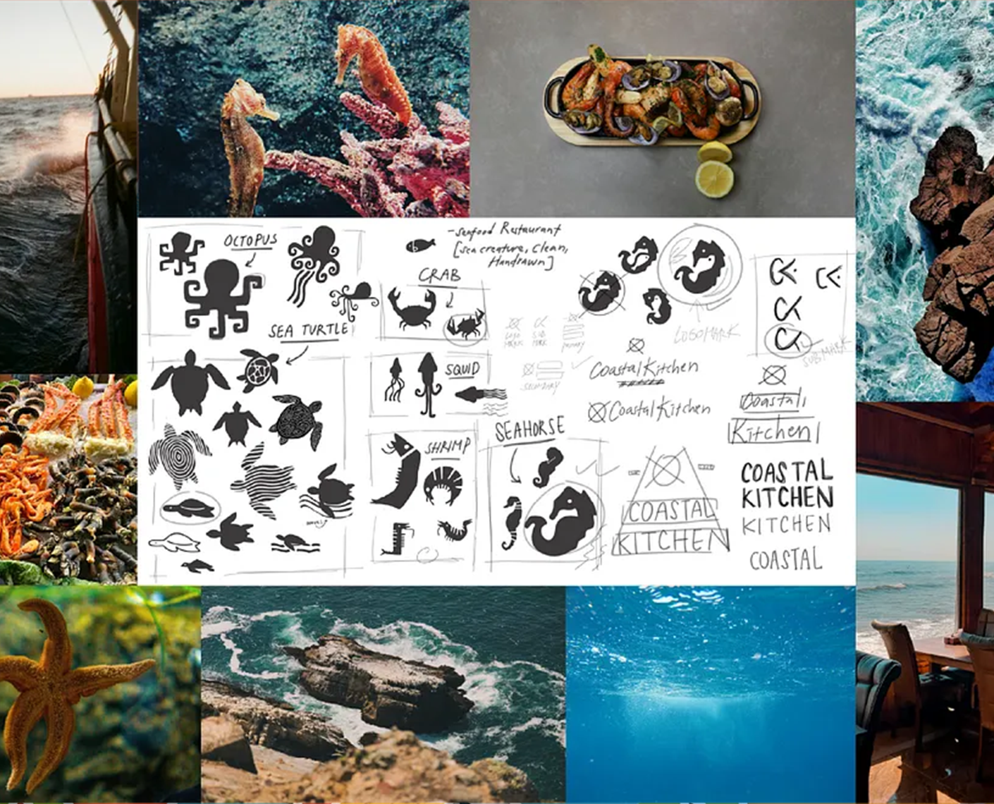
I began with in-depth research to immerse myself in the brand's world. This included visiting the restaurant to experience its ambiance, menu, and customer interactions firsthand. I analyzed competitor brands in the seafood and coastal dining space, noting common tropes like anchors or waves, and identified opportunities to differentiate with more organic, creature-inspired motifs.
I compiled a mood board featuring ocean imagery, sea creatures (such as seahorses, octopuses, crabs, squid, shrimp, and sea turtles), and coastal landscapes. This visual research drew from real-world inspirations like underwater photography and beach scenes, combined with hand-drawn sketches to explore initial ideas. I also conducted client interviews and surveys with potential customers to gather insights on what "coastal freshness" means to them—themes like sustainability, vibrancy, and indulgence emerged. Color palette exploration focused on deep blues, reds, and whites to evoke the sea and fresh ingredients, while typography research led to clean, bold sans-serif fonts for readability and modernity.
Concept Development
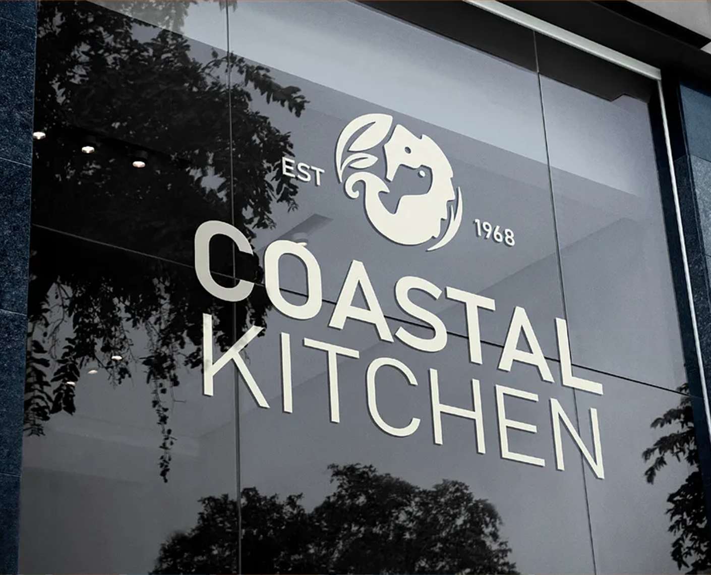
Building on the research, I moved into sketching and ideation. The logo concept centered on a stylized seahorse integrated with leaf-like elements to symbolize the fusion of sea and fresh produce, forming a circular emblem for versatility. I iterated through dozens of hand-drawn variations of sea creatures, refining them into a final seahorse design that feels whimsical yet sophisticated.
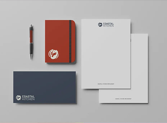
From there, I developed the full brand system:
- Stationery Set: A red notebook with the logo embossed, white letterhead with subtle branding, a navy envelope, and a business card all using eco-friendly paper to align with sustainability goals.
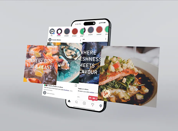
- Social Media Templates: Instagram-style posts featuring appetizing seafood photos overlaid with taglines like "Every Bite is a Feast" and "Where Freshness Meets Flavour," with a consistent color scheme and logo placement for easy customization.
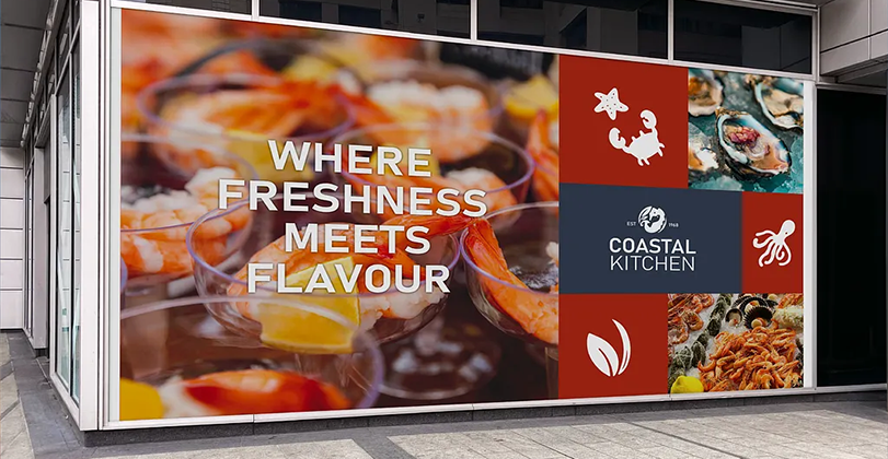
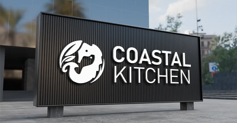
- Signage: A black billboard with the logo and bold text, a vibrant window wrap showcasing seafood imagery and the slogan, a glass decal with "EST 1968" for historical nod, and a semi-transparent logo overlay on a restaurant window to blend with urban surroundings.
I used digital tools like Adobe Illustrator for vector work and Photoshop for mockups, creating prototypes and gathering client feedback in two rounds of revisions to ensure alignment.
Results and Impact
The completed branding was delivered as a full style guide with assets in various formats, ready for implementation. Post-launch, the client reported a 25% increase in social media engagement within the first month, attributing it to the visually appealing templates that highlighted their dishes. The signage has enhanced street presence, drawing more walk-ins, and the stationery has professionalized their communications.
Overall, the project successfully refreshed Coastal Kitchen's identity, making it more memorable and aligned with modern dining trends while preserving its heritage. This has positioned the brand for expansion, with plans for merchandise and website integration using the new assets.
![]() Let's talk about your project!
Let's talk about your project!