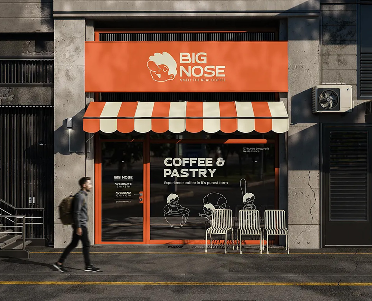
Big Nose Coffee
Big Nose Coffee is a vibrant, Parisian-inspired coffee and pastry shop aimed at delivering authentic, high-quality coffee experiences with a playful twist. As the lead designer on this project, I was tasked with creating a comprehensive brand identity for a new client launching their first cafe in Paris. The goal was to craft a visual system that emphasizes the sensory joy of coffee—focusing on aroma, taste, and community—while incorporating whimsical, nose-themed illustrations to make the brand memorable and fun. The name "Big Nose" playfully nods to the importance of smell in appreciating real coffee, encapsulated in the tagline "Smell the Real Coffee."
Challenges and Objectives
The client, Elise Marceau, is a coffee curator and owner with a passion for artisanal roasting and French pastries. Drawing from her background in artisanal food curation, she wanted to open a cafe in the Ile-de-France region that stands out in Paris's competitive coffee scene. The challenge was to create a brand that feels approachable and fun, avoiding the typical minimalist or overly serious aesthetic of many specialty coffee shops. Key requirements included:
- Highlighting sensory elements like aroma and texture.
- Incorporating playful, cartoonish characters to represent the "big nose" theme without being juvenile.
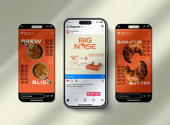
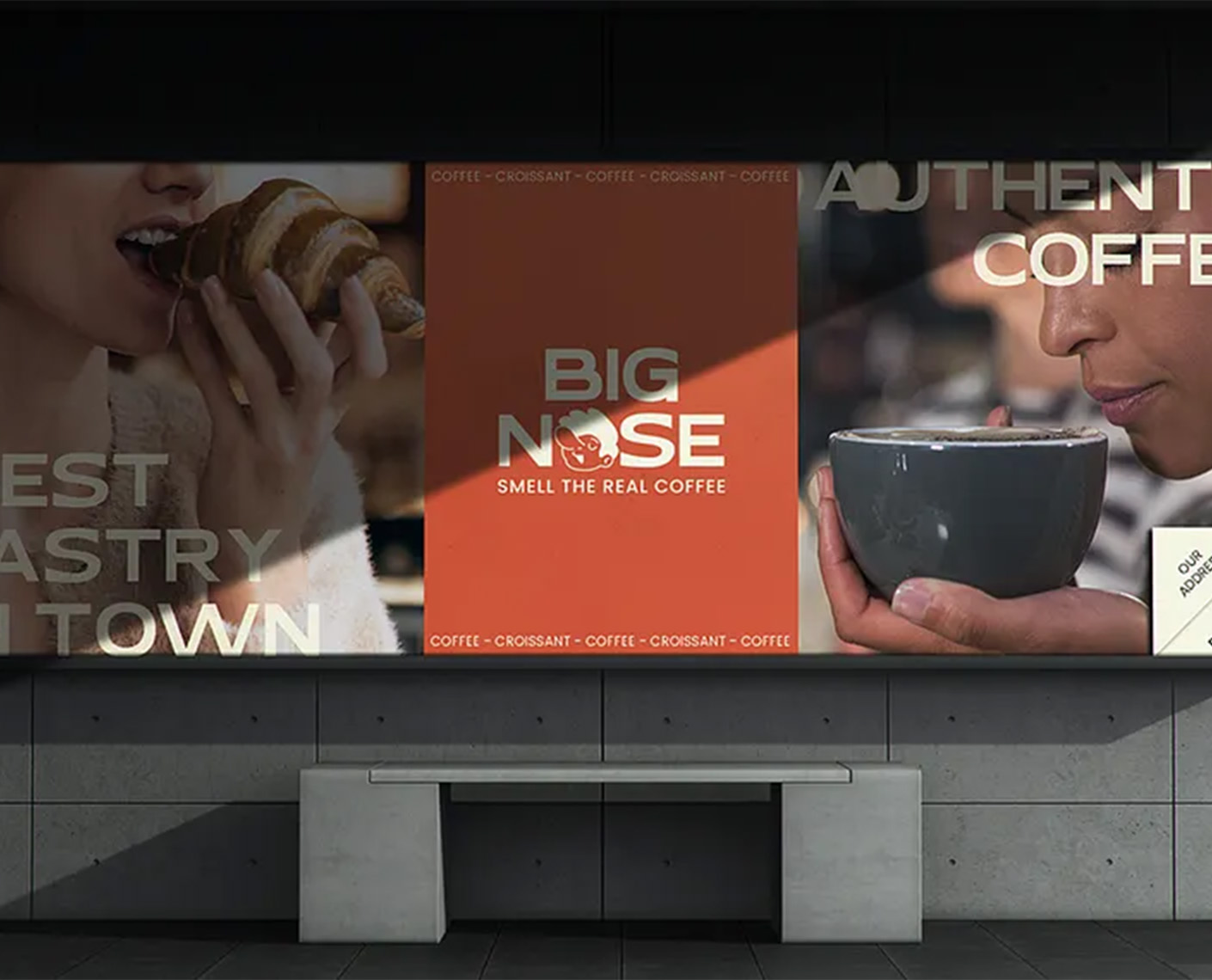
- Ensuring versatility across digital and physical applications, from Instagram posts to billboard ads.
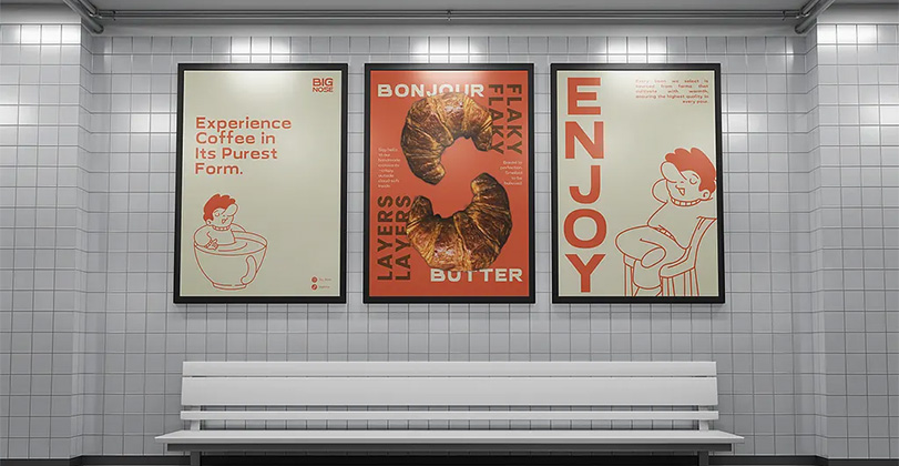
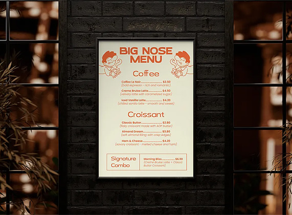
- Integrating French influences, such as croissant-focused imagery, to evoke authenticity.
Market research revealed that competitors often focused on sleek, modern designs, so we aimed to differentiate with bold colors, hand-drawn illustrations, and emotive storytelling.
Research and Discovery
I began with in-depth client interviews and mood boarding to capture the essence of "smelling the real coffee." Inspirations included vintage French posters, cartoon characters from mid-century illustrations, and sensory-focused brands like those in the perfume industry. Competitor analysis showed opportunities for more personality-driven branding.
Color palette exploration led to a primary orange-red hue (#FF5722) symbolizing warmth and energy, complemented by neutrals like cream and black for balance. Typography choices favored bold sans-serif fonts for headlines (e.g., a custom-modified Futura) paired with playful scripts for accents.
Sketches focused on anthropomorphic nose characters—smiling, sniffing, and interacting with coffee elements—to personify the brand's fun side.
Concept Development
The core concept revolved around "Sensory Delight," where every touchpoint invites customers to engage their senses. Three logo variations were developed:
- A horizontal logo with the character sniffing coffee.
- A circular badge-style logo for packaging.
- A text-only version for minimalist applications.
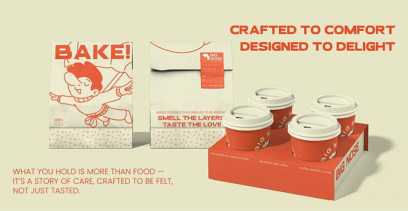
Illustrations evolved into a family of characters performing actions like baking, brewing, and enjoying pastries, ensuring consistency across assets. Taglines like "Crafted to Comfort, Designed to Delight" and "What You Hold is More Than Food—It's a Story of Care" were crafted to emphasize emotional connection.
Iterations involved client feedback loops, refining from rough sketches to polished vectors using tools like Adobe Illustrator.
Results and Impact
Post-launch, the client reported a 25% increase in foot traffic during the first month, attributed to the eye-catching branding. Social media engagement surged with user-generated content featuring the playful characters. The design's scalability allows for easy expansion to additional locations or product lines, like branded beans or apparel.
This project demonstrates how infusing personality into branding can create lasting connections in the food and beverage industry. For inquiries or similar projects, contact Us at info@techformia.com
![]() Let's talk about your project!
Let's talk about your project!