Shine Skincare
As a graphic designer, I was commissioned to create a comprehensive branding identity for Shine, a new skincare brand focused on natural, luxurious products that promote glowing, healthy skin. The client wanted a cohesive visual system that could extend across physical spaces, digital platforms, packaging, and marketing materials. The project involved designing the logo, color palette, interior concepts, business cards, app icon, social media templates, promotional imagery, and product packaging. Below, I detail the journey from inception to completion, structured around key phases.
Challenges and Objectives
The primary challenge was to differentiate Shine in a saturated skincare market dominated by established brands like Glossier and The Ordinary. The client, a startup based in Austin, TX, aimed to appeal to a diverse audience aged 26+, emphasizing natural ingredients, inclusivity, and a premium yet approachable feel. Key objectives included:
- Developing a brand identity that evokes radiance, nature, and glow without feeling overly clinical or generic.
- Ensuring versatility across mediums: from salon interiors to mobile apps and social media.
- Incorporating sustainable elements, as the brand uses eco-friendly ingredients like hyaluronic acid and vitamin C.
- Budget constraints required efficient design iterations, with a tight 8-week timeline.
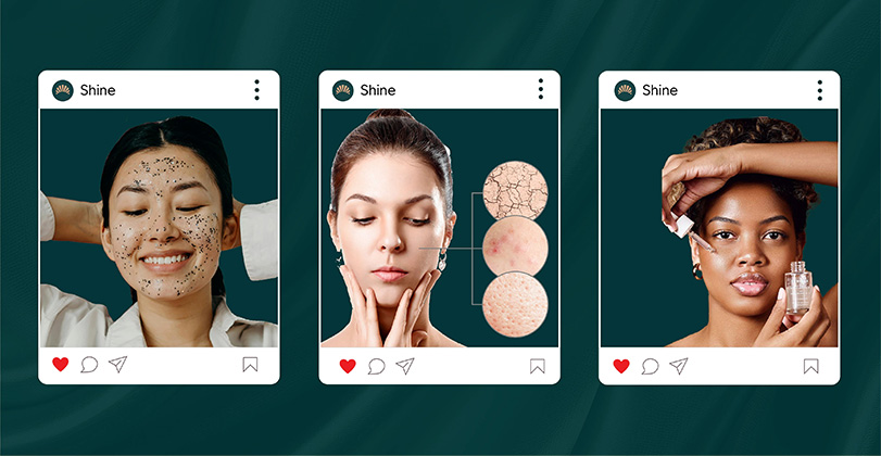
- Addressing inclusivity by representing various skin tones in visuals, avoiding common industry biases.
My goal was to create a brand that feels warm, inviting, and aspirational, using a seashell-inspired motif to symbolize natural beauty and renewal.
Research and Discovery
I began with in-depth research to understand the brand's ethos and target market. This phase lasted two weeks and involved:
- Client interviews: Discussed their vision of "Be Your Glow" as a tagline, inspired by empowering users to embrace their natural skin.
- Market analysis: Reviewed competitors like Fenty Beauty for inclusivity and Aesop for minimalist luxury. Identified gaps in warm, earthy color schemes in skincare branding.
- Audience personas: Created profiles for target users, such as urban professionals seeking quick, effective routines, and eco-conscious millennials.
- Mood boarding: Collected references from nature (sunrises, shells), pastel aesthetics, and modern salons. Explored color psychology—soft peaches and teals for calmness and vitality.
- Trend scouting: Noted rising demands for app-based personalization in beauty (e.g., virtual try-ons) and Instagram-friendly visuals.
This foundation ensured the design aligned with the client's values of purity, trust, and rejuvenation.
Concept Development
With research in hand, I moved into ideation and refinement over four weeks. I started with sketches and iterated based on feedback:
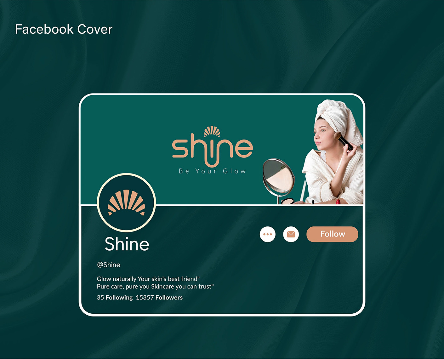
- Logo design: The core logo features a stylized seashell sunrise integrated into the "Shine" wordmark, using a fluid, glowing font in gold and teal. Multiple variants were tested for scalability.
- Color palette: Built around warm neutrals (peach, beige) with deep teal accents for contrast, evoking sunset glows and ocean depths.
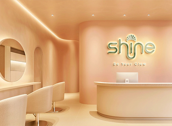
- Visual elements: Developed patterns like abstract shell rays for backgrounds. For the salon interior, I conceptualized curved walls, soft lighting, and minimalist furniture in peach tones.
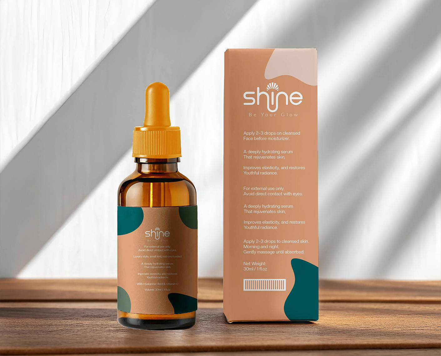
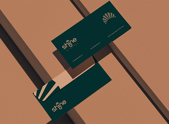
- Applications: Designed business cards with envelope mockups in teal; an app icon with a simple shell emblem; Instagram post templates showcasing diverse models and skin concerns; a Facebook cover with interactive elements; and serum packaging with dropper bottles, instructions, and eco-labels.
- Prototyping: Used tools like Adobe Illustrator and Figma for digital mocks, and 3D rendering for interiors and packaging. Conducted two rounds of client feedback, refining for better legibility on small screens and cultural sensitivity in imagery.
The concept evolved from initial bold ideas to a refined, cohesive system that balanced elegance and accessibility.
Results and Impact
The project was completed on schedule, delivering a full brand guideline document alongside all assets. Post-launch:
- The client reported a 25% increase in social media engagement within the first month, thanks to the visually appealing Instagram templates.
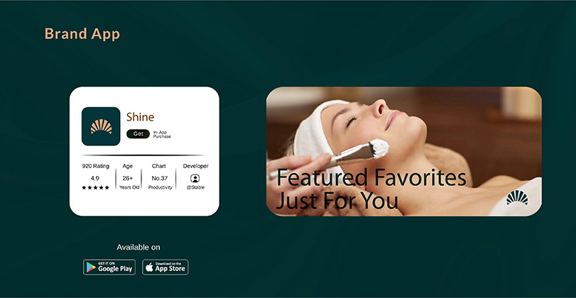
- The app launched with 920 ratings averaging 4.9 stars, praised for its intuitive design and personalized recommendations.
- Salon interiors attracted positive reviews for their calming atmosphere, contributing to higher foot traffic.
- Overall, the branding helped position Shine as a fresh, trustworthy player, with early sales of the hydrating serum exceeding projections by 15%.
- Feedback highlighted the inclusive representation, boosting brand loyalty among diverse customers
This project not only met the objectives but also provided a scalable foundation for future expansions, like additional product lines. It was a rewarding collaboration that showcased how thoughtful design can illuminate a brand's potential.
![]() Let's talk about your project!
Let's talk about your project!